Project Overview
User Research: Summary
For my user research, I conducted a mix of user interviews and competitor analysis to understand the needs, goals, and frustrations of potential Taco Mata customers. I initially assumed that most users would be young, tech-savvy food enthusiasts who primarily value bold flavors and visual appeal. However, through interviews with a diverse group of participants, I discovered a broader audience—including older, less tech-savvy individuals—who value simplicity, clarity, and cultural connection just as much as flavor. This research shifted my focus toward designing a solution that balances visual engagement with ease of use, catering to both experienced app users and those seeking a straightforward ordering process.
Pain Points
Complicated App Interface
Users who are less tech-savvy, struggle with confusing layouts or complicated multi-step navigation. The focus will be on creating a clean and intuitive interface and minimal steps to complete tasks.
Unclear Pickup Times
Busy users feel frustrated when apps don't provide accurate or clear pickup times. The focus will be on incorporating a dynamic time selector and provide real-time updates.
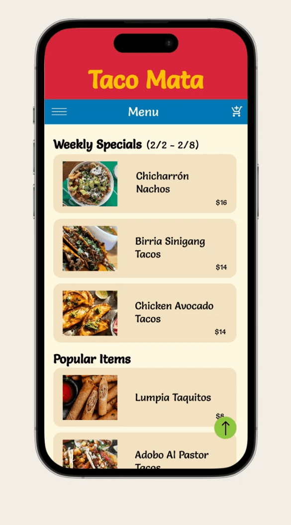
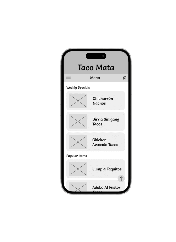
Lack of Menu Transparency
Customers want detailed information about dishes, including ingredients, dietary tags, and customizability. The focus will be on designing a menu with detailed descriptions and customization options clearly displayed.
User Personas
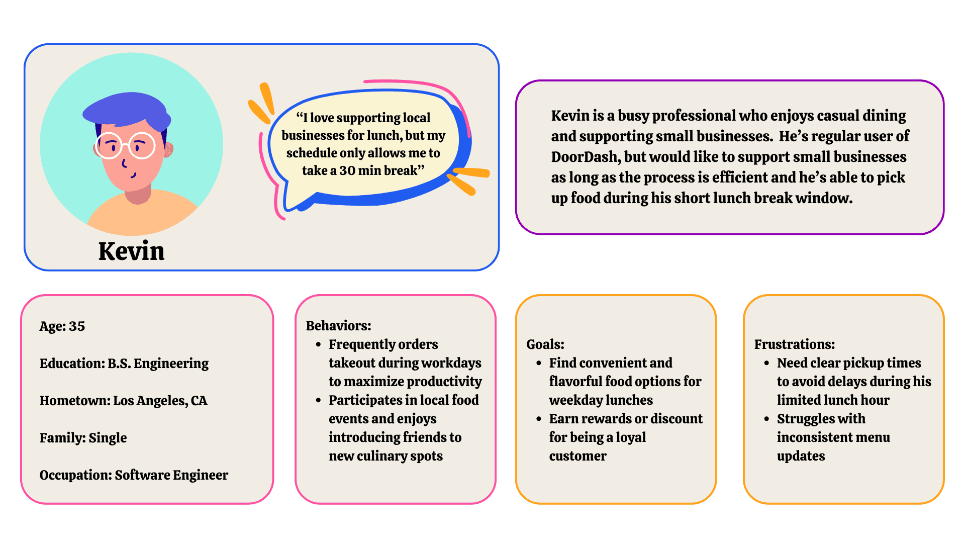
Kevin
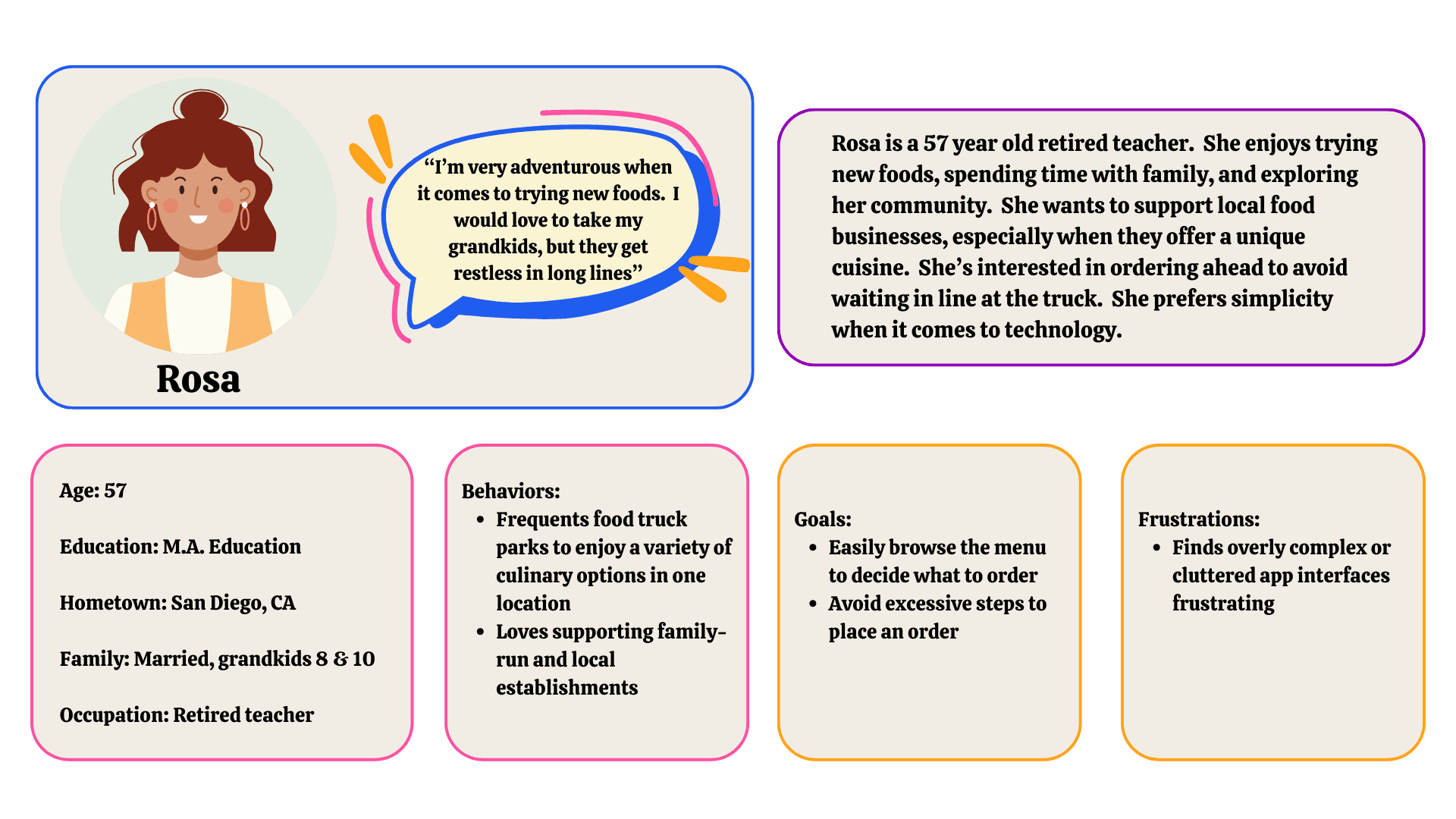
Rosa
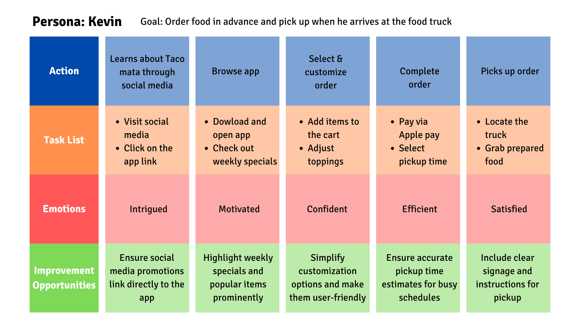
User Journey Maps
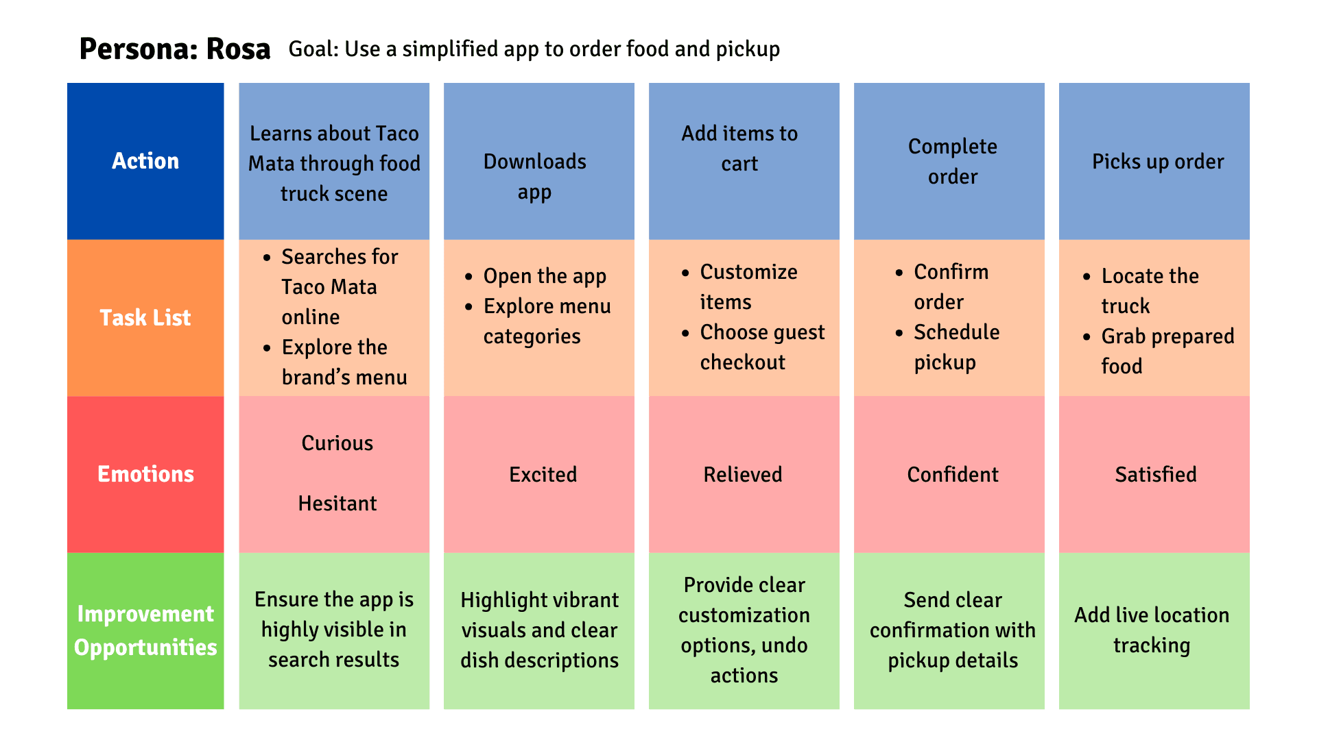
Rosa values simplicity and clarity in her digital interactions. She’s more confident when the app provide intuitive navigation. Small features, like a guest checkout option and live truck tracking, greatly improves her experience. Personal touches, like loyalty notifications, make her feel appreciated and connected to the brand.
Paper Wireframes
The goal of the paper wireframes was to quickly explore different layout ideas and user flows before committing to digital wireframes. These low-fidelity sketches allowed for rapid iteration, ensuring that the app’s core structure, navigation, and key functionalities were intuitive and aligned with user needs.
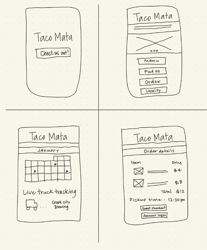
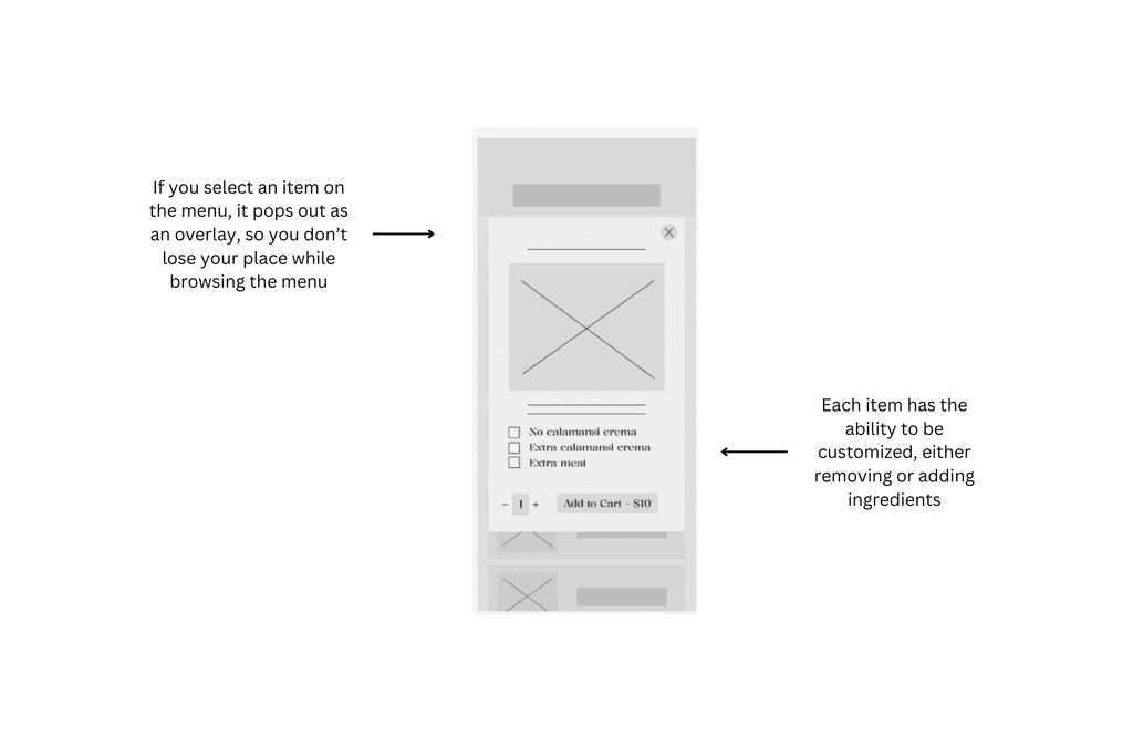
In this frame, I wanted to demonstrate the importance of viewing all of the ingredients in a menu item, then having the opportunity to customize it to the customer's liking. Customization also supports various dietary restrictions, appealing to a wider audience.
Usability Studies: Round 1 Findings
User wants clear navigation labels
Users felt overwhelmed by customization options
Users were unsure how to find the truck’s location
Usability Studies: Round 2 Findings
Users requested modification choices to be larger buttons
Users appreciated grouped customization options
Users requested real-time order status updates
Refining the Design
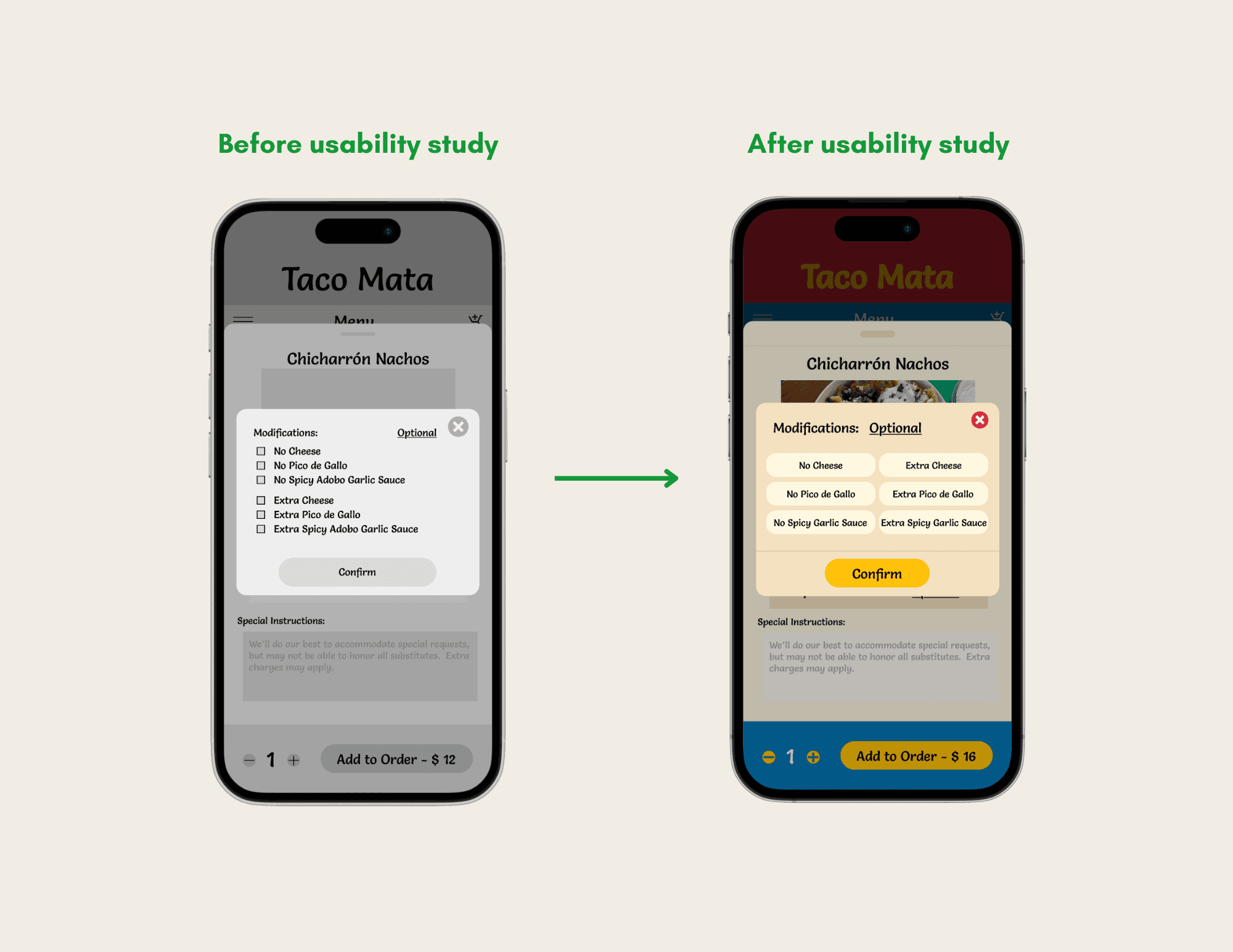
Users expressed changing the checkboxes to larger buttons. This would help decrease the pressing of incorrect options and to further increase accessibility, the buttons will get "highlighted" when pressed, clearly indicating a selection has been made.
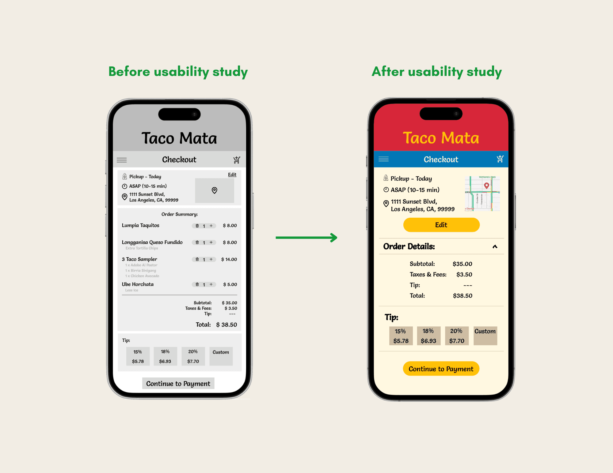
Initially, when checking out, all the important information was presented in one frame; however, that resulted in the font being too small and an overall cluttered look. Therefore, the information was condensed into a drop down menu, with an option to display all the information, overlays, and larger action buttons.
Takeaways
Next Steps
Loyalty Rewards
Create additional rewards features for customers, encouraging customer loyalty
Self Promotion
Market the app through social media and in-person promotions
Delivery Expansion
Expand functionality to include delivery partnerships